Documentaion for the latest release (v1.2.1) of XPANDA. Older versions: 1.0.0, 1.1.0, 1.2.0

Getting Started

Install Files

XPANDA, in its most basic setup, needs the following files to work:

Load the core css file in the <head> at the top of your page as seen below:

<link rel="stylesheet" href="css/xpanda.core.css">

Then, just before the closing </body>, add the following lines:

<script src="https://cdnjs.cloudflare.com/ajax/libs/underscore.js/1.9.1/underscore-min.js"></script>
<script src="https://cdnjs.cloudflare.com/ajax/libs/jquery/3.4.1/jquery.min.js"></script>
<script src="js/jquery.xpanda.min.js"></script>

Add Markup

The most basic implementation of XPANDA needs the following HTML markup to function. It consists of a container, items, thumbnail images and content to display once item is expanded. You simply need to add an id to the main container div (#xpanda-1 in this case) as well as a data instance attribute (data-instance="1" in this case). Then add some items to it:

<div id="xpanda-1" class="xpanda" data-instance="1">
    <div class="x-item">
        <a href="#">
            <img src="thumbnail-1.jpg">
        </a>
        <div class="x-content">
            [ANY HTML CONTENT CAN BE DISPLAYED HERE]
        </div>
    </div>
    <div class="x-item">
        <a href="#">
            <img src="thumbnail-2.jpg">
        </a>
        <div class="x-content">
            [ANY HTML CONTENT CAN BE DISPLAYED HERE]
        </div>
    </div>
    <div class="x-item">
        <a href="#">
            <img src="thumbnail-3.jpg">
        </a>
        <div class="x-content">
            [ANY HTML CONTENT CAN BE DISPLAYED HERE]
        </div>
    </div>
</div>

Initialize

And finally, to initialize XPANDA, the following javascript code needs to be added after the 3 files we added right before the closing </body> tag:

<script>
    $("#xpanda-1").xpanda();
</script>

HTML Structure

Layout

Below is a visual representation of the structure of XPANDA. Each of the items highlighted will be discussed in their respective sections that follow.

XPANDA - Visual Representation

Container

As you can see from the example above there needs to be an element containing all the items. This container element requires a class of "xpanda" and an ID so that when the XPANDA is initiated it will find this ID to work with. Currently it has the ID of "xpanda-1" but could be replaced by any other valid ID. Another thing to note is that this container's width will be used (and not the browser window) to determine the amount of items in a row for each breakpoint.

<div id="xpanda-1" class="xpanda" data-instance="1">
    <div class="x-item">...</div>
    <div class="x-item">...</div>
    <div class="x-item">...</div>
    <div class="x-item">...</div>
</div>

Container State Classes

Class Description
x-initiated This class will be automatically added which helps with the seperation of browsers with javascript enabled or disabled.
x-lazyload-thumbnail Add this class to enable lazyload for thumbnail images. To have this work please read more here.
x-lazyload-asset Add this class to enable lazyload for large images within the expander. To have this work please read more here.
x-preloader Add this class to enable the overall preloader. To have this work please read more here.
x-fix-width Add this class to remove the side margins from the container to line up with the css grid. This is usually needed for Bootstrap, Foundation and other CSS Frameworks.

Item

Before we start with the explanation of the structure of the items, please note that an additional container will "wrap" the items of each row with the class "x-item-wrap". See below:

<div class="x-item-wrap">
    <div class="x-item">...</div>
    <div class="x-item">...</div>
    <div class="x-item">...</div>
    <div class="x-item">...</div>
</div>

Now, below is a demonstration of how each item's HTML markup should look. First-off, each item should have a class of "x-item", and then each item contains an anchor tag and an element <div class="x-content"> containing the HTML that will be displayed within the expander. Usually, within the anchor tag, a thumbnail image will exist, since this is a gallery plugin after all, but plain HTML can also be used to customize the item's look and feel.

<div class="x-item">
    <a href="#">
        <img src="thumbnail-1.jpg">
    </a>
    <div class="x-content">
        [ANY HTML CONTENT CAN BE DISPLAYED HERE]
    </div>
</div>

Item State Classes

Class Description
x-is-active This class is exposed for styling purposes for when an item has it's content expanded.
x-is-not-active This class is added to style non-active items but is only exposed when another item is active.
x-is-loaded This class is only used in conjunction with the thumbnail lazyloader. To have this work please read more here.

Expanded Content

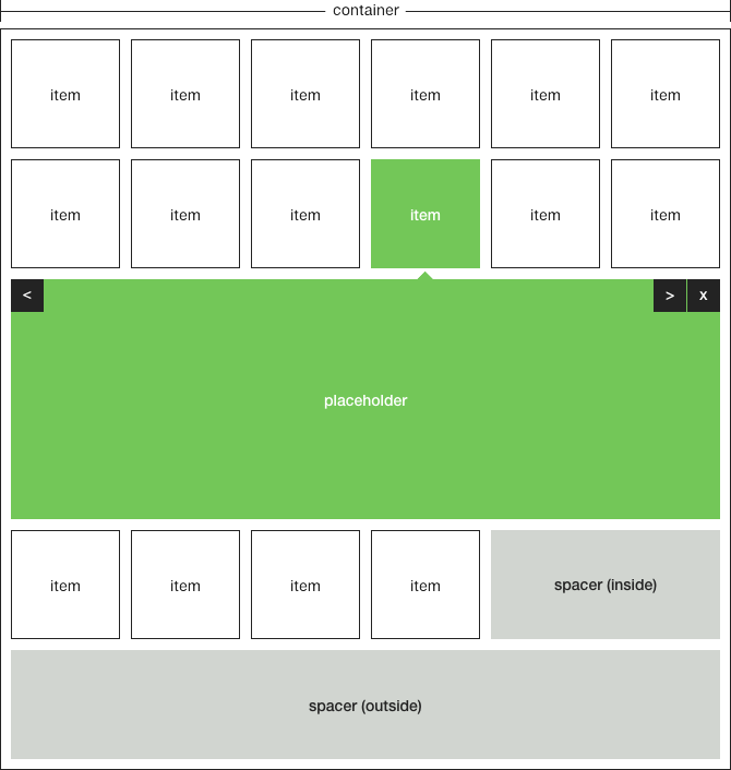
As the previous tab already mentioned, an element <div class="x-content"> will house all the content that needs to display when the item is expanded. The content within this element can be any HTML markup but XPANDA also comes with predefined layout options.

These layout options either consists of an image, an image with related content or standalone content with no image present. The div elements used for the image and content are as follow:
x-asset
x-info

These options can now even be further customised by adding classes to the elements to assign the position of the asset and content relative to each other. If that doesn't make sense, please see below code examples:

Asset Only

Content consists only of an asset with an image that will be 100% wide:

<div class="x-content">
    <div class="x-asset">
        <img src="large-1.jpg">
    </div>
</div>

The following example consists only of an asset with an image but when the class x-asset-center is added the image will be centered and have a width of 75% relative to the container:

<div class="x-content">
    <div class="x-asset x-asset-center">
        <img src="large-1.jpg">
    </div>
</div>

Asset and Content

The example to follow will show the asset to the left and the related content to the right:

<div class="x-content">
    <div class="x-asset x-asset-left">
        <img src="large-1.jpg">
    </div>
    <div class="x-info x-info-right">
        [ANY HTML CONTENT CAN BE DISPLAYED HERE]
    </div>
</div>

Because of the order property provided by flexbox there is no need to swop around the markup to have the image on the right and the info on the left, the classes will do the ordering automatically:

<div class="x-content">
    <div class="x-asset x-asset-right">
        <img src="large-1.jpg">
    </div>
    <div class="x-info x-info-left">
        [ANY HTML CONTENT CAN BE DISPLAYED HERE]
    </div>
</div>

Content Only

The last example is when there is only content to be displayed with no asset present (please note that x-info will not be styled correctly and x-info-centerneeds to be added):

<div class="x-content">
    <div class="x-info x-info-center">
        [ANY HTML CONTENT CAN BE DISPLAYED HERE]
    </div>
</div>

Asset Classes

Class Description
x-asset Default class.
x-asset-left Align left.
x-asset-right Align right.
x-asset-center Align center.
x-is-loaded This class is only used in conjunction with the large image lazyloader. To have this work please read more here.
x-was-loaded This class is only used in conjunction with the large image lazyloader. To have this work please read more here.

Info Classes

Class Description
x-info Default class, but needs to be used in conjunction with one of the below classes.
x-info-left Align left.
x-info-right Align right.
x-info-center Full width.

Placeholder

The placeholder is the stage for expanded content to appear. All the content within x-placeholder is cloned content from the active item's x-content element. The placeholder element is automatically appended after each row of items which is "wrapped" with the x-item-wrap element. The below is a demonstration of that:

<div class="x-item-wrap">
    <div class="x-item">...</div>
    <div class="x-item">...</div>
    <div class="x-item">...</div>
    <div class="x-item">...</div>
</div>
<div class="x-placeholder">...</div>
<div class="x-item-wrap">
    <div class="x-item">...</div>
    <div class="x-item">...</div>
    <div class="x-item">...</div>
    <div class="x-item">...</div>
</div>
<div class="x-placeholder">...</div>

Placeholder Classes

Class Description
x-placeholder Default class.
x-is-expanded Active placeholder.

Controls

Controls for navigating between items are automatically created within the placeholder but can be switched off (see Options).

Controls Classes

There is only one class additionally available for the next and previous buttons to help with the styling of a disabled arrow either when the first is active (which disables the previous button) or the when the last item is active (disables the next button).

Class Description
x-close Default close button class.
x-arrow Default arrow button class.
x-prev The class for the previous arrow button.
x-next The class for the next arrow button.
x-arrow-disabled The class for styling the disabled next and previous buttons.

Spacer

If you see above in our visual representation there are 2 spacer elements; an inside and outside spacer. This is only to demonstrate how it works and only one spacer will show at any given time. The inside spacer x-spacer-inside is a "row filler" when the items in the last row does not fill the full width of the row. The inside spacer will always exist and is good placement for a Call to Action.

The outside spacer x-spacer-outside is outside of the main container and is where the content for both the spacers are placed. The inside spacer clones the content from here.

Another thing to note is a data instance attribute has been added to relate the spacer with a particluar gallery in the case of multiple galleries on one page. Please see below:

<div id="xpanda-1" class="xpanda" data-instance="1">...</div>
<div class="x-spacer-outside" data-instance="1">
    [ANY HTML CONTENT CAN BE DISPLAYED HERE BUT IS QUITE LIMITED]
</div>

Spacer Classes

Class Description
x-spacer-inside The class for styling the spacer when it is within an item row.
x-spacer-outside The class for styling the spacer when it is outside the main container.
x-initiated This class will be automatically added when XPANDA has been succesfully initiated.
x-spacer-empty If the outside spacer is either missing from the markup or doesn't contain any HTML this class will be added to the inside spacer.

Customization

Styling

XPANDA ships with a core css stylesheet. This file should be included as XPANDA will not work without it. Please see the Install Files at the top of this page to see how to include it. Additionally to the core file there are other stylesheets that are included in the download package. To include a "theme", call the theme below the core stylesheet, see below example:

<link rel="stylesheet" href="css/xpanda.core.css"> <!-- Core stylesheet -->
<link rel="stylesheet" href="css/xpanda.blank.css"> <!-- Blank stylesheet -->

Also included in the downloaded package is a empty stylesheet with all the possible classes that enables you to create custom themes.

Additional Markup

Within the examples added with your download some of them have addtional content or markup within the thumbnail area. This is perfect for those hover animations you want to add, or even if you do not want to add any thumbnail to the items at all. To use markup within the thumbnail area an additional element with the class of x-thumbnail-content can be added. Either stand-alone or right underneath the image.

Below the example with an image as usual:

<div class="x-item">
    <a href="#">
        <img src="thumbnail-1.jpg">
        <div class="x-thumbnail-content">
            [ANY HTML CONTENT CAN BE DISPLAYED HERE]
        </div>
    </a>
    <div class="x-content">...</div>
</div>

or, the example without an image:

<div class="x-item">
    <a href="#">
        <div class="x-thumbnail-content">
            [ANY HTML CONTENT CAN BE DISPLAYED HERE]
        </div>
    </a>
    <div class="x-content">...</div>
</div>

Options

Below is all the JS configurable options for xpanda with their defaults:

<script>
    $("#xpanda-1").xpanda({
        breakpoints: {                      // 6 available container breakpoints for setting the amount of items per row for each breakpoint
            xs: {                           // extra small
                minWidth: 0,                // min width in px
                itemsPerRow: 2              // items per row
            },
            sm: {                           // small
                minWidth: 576,              // min width in px
                itemsPerRow: 4              // items per row
            },
            md: {                           // medium
                minWidth: 768,              // min width in px
                itemsPerRow: 6              // items per row
            },
            lg: {                           // large
                minWidth: 992,              // min width in px
                itemsPerRow: 8              // items per row
            },
            xl: {                           // extra large
                minWidth: 1200,             // min width in px
                itemsPerRow: 10             // items per row
            },
            xx: {                           // extra extra large
                minWidth: 1400,             // min width in px
                itemsPerRow: 12             // items per row
            }
        },
        element: {                          // the clickable item
            selector: ".x-item",            // class of item
            equalThumbSizes: true,          // change to "false" when thumbnail images are different dimensions or sizes
            wrapperClass: "x-item-wrap",    // once xpanda initializes an element with this class will wrap each row of items
            toClone: ".x-content",          // the class that specifies which content to place in the expanded container
            spaceBetweenItems: 10,          // the space between each item (horizontally) in px
            spaceBetweenRows: 10            // the space between each row of items in px
        },
        placeholder: {                      // placeholder where the content will display
            class: "x-placeholder",         // the expandad container's class
            marginSides: 10,                // the space on the sides of the expanded container
            desktopScrollTo: true,          // scroll to the expanded container for desktops? true or false
            scrollSpeed: 400,               // speed of the scrolling when desktopScrollTo has been set to true
            scrollTopOffset: 0,             // the scrolltop offset (set to the height of a fixed header) 
            slideAnimation: true,           // slide open and close of the expanded container? true or false
            slideSpeed: 400,                // the slide animation speed of the opening container when slideAnimation has been set to true
            showControls: true              // show the exapnder close and navigation items
        },
        spacer: {                           // the spacer is the "filler" element when items doesn't fill the last row
            class: "x-spacer-inside"        // the class of the spacer
        },
        independent: true,                  // set to false to have multiple instances be dependent on each other (will collapse each other's items)
        history: false                      // set to true to enable the history pushState which allows for sharing expanded items
    });
</script>

LazyLoad

XPANDA has an image lazyloader built in and doesn't need any other third party lazyloader plugin. There is an option to have either the thumbnail or the asset image lazyload but can also be assigned simultaneously. To have only the thumbnail image lazyload add the class of x-lazyload-thumbnail to the wrapper container element like below:

<div id="xpanda-1" data-instance="1" class="xpanda x-lazyload-thumbnail">

To have only the asset image lazyload add the class x-lazyload-asset to the wrapper container element. See below:

<div id="xpanda-1" data-instance="1" class="xpanda x-lazyload-asset">

And lastly, to have both the thumbnail and the asset image lazyload, just add both the classes as seen below:

<div id="xpanda-1" data-instance="1" class="xpanda x-lazyload-thumbnail x-lazyload-asset">

Please bare in mind that a low quality version of the images needs to be loaded for this to work. To do this add a data-src attribute to the img tag as seen below:

<div class="x-item">
    <a href="[PATH-TO-HIGH-RESOLUTION-IMAGE-IF-JAVASCRIPT-DISABLED]" target="_blank">
        <img src="[PATH-TO-LOW-RESOLUTION-THUMBNAIL-IMAGE]" data-src="[PATH-TO-HIGH-RESOLUTION-THUMBNAIL-IMAGE]">
    </a>
    <div class="x-content">
        <div class="x-asset">
            <img src="[PATH-TO-LOW-RESOLUTION-LARGE-IMAGE]" data-src="[PATH-TO-HIGH-RESOLUTION-LARGE-IMAGE]">
        </div>
    </div>
</div>

History pushState

To be able to share links of expanded items; history pushState support has been added. This will add a ? seperator after the url string followed by a description or title of each item. To enable this feature set the history settings via the options to true and be sure to add short descriptions to each item as the data-path attribute like below:

<div class="x-item" data-path="sunray-through-trees">...</div>

Preloader

This functionality hides the gallery and adds a loader image until the DOM is loaded. This solves the jumpy rendering issue. To have the preloader function on your gallery, please add x-preloader to the wrapper container element. See below:

<div id="xpanda-1" data-instance="1" class="xpanda x-preloader">

Please don't hesitate to contact me if further assistance is needed via my Support Forum or leave a comment on CodeCanyon.